
The Shape Series : How Curves Define Our World (.. and your Organization)

Have you ever noticed how we sometimes think in shapes rather than words? When you visualize growth, are you seeing a mountain, a wave, or maybe a rocket taking off? Welcome to the world of growth curves, where the shapes tell the story, and the numbers just play backup. Let's dive into this visually delightful world, giving each curve a quirky personality that you'll remember the next time you spot them in the wild.
1. The Rocket 🚀 (Exponential Growth Curve)
This curve blasts off with a growth rate that’s proportional to its current value, leading to an ever-accelerating rise.
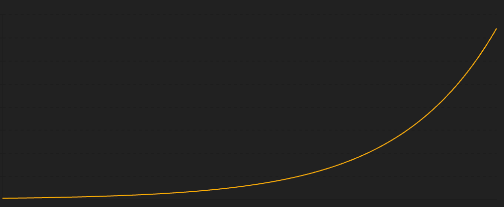
Why It Matters: Picture a snowball rolling downhill, getting bigger and faster. Exponential growth is like that, common in tech adoption, viral content, and yes, even population booms.
Remember when smartphones were just for the tech-savvy? Then, boom! Everyone had one. That's our Rocket curve in action, soaring higher and faster with every new user jumping on board. It’s also how those hilarious cat videos go viral – one share leads to another, and soon, everyone’s laughing.
2. The Plateau Climb 🐍 (Logistic Growth Curve)
This curve starts with a burst of speed but then slows down as it nears the top, eventually leveling off.
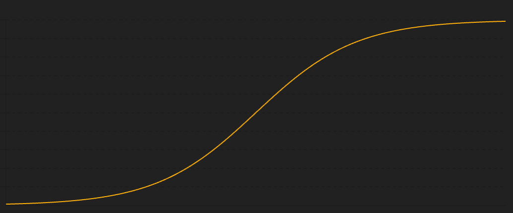
Why It Matters: It’s the tale of many a successful product, racing up with initial excitement before hitting a saturation point.
Think of Facebook. It raced up the popularity charts, but now it’s coasting along the top, having connected nearly everyone. It’s also like your favorite new restaurant that everyone rushes to try, but once everyone’s had their fill, the excitement plateaus.
3. The Steady Eddie 📈 (Linear Growth Curve)
This curve is all about consistency, increasing at a constant rate over time.
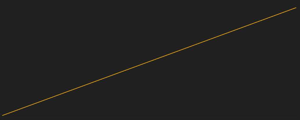
Why It Matters: While less thrilling, it's the reliable underdog in predictable, steady growth scenarios.
Imagine a small bakery in your neighborhood. Every year, it gets a few more loyal customers, steadily growing without the fireworks. That’s Steady Eddie – dependable and predictable, like your morning coffee routine.
4. The Falling Star 📉 (Exponential Decay Curve)
This curve shines bright, then quickly fades away, decreasing rapidly over time.
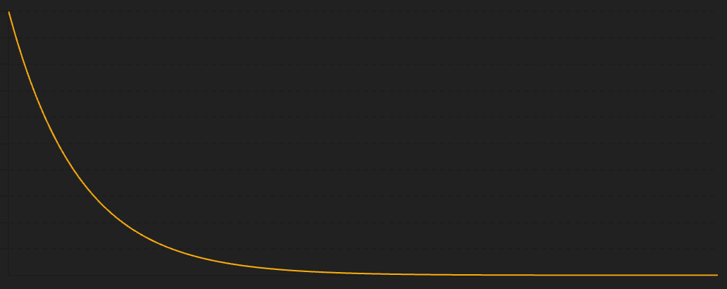
Why It Matters: It’s the cautionary tale of what goes up must come down, often due to obsolescence or market saturation.
Remember DVD rentals? They were all the rage until streaming services arrived. Our Falling Star burned bright but fell fast, just like those tech gadgets we can’t live without one year and forget the next.
5. The Hype Cycle 🎢 (Parabolic Growth Curve)
Meet the Hype Cycle: This curve starts with a bang, climbs to a peak, and then crashes down, forming a bell-shaped trajectory.
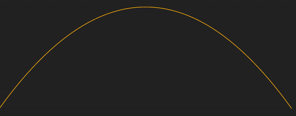
Why It Matters: It's the drama queen of growth curves, seen in speculative bubbles and fleeting fads.
Think of the dot-com bubble. The tech world shot up like a rocket, only to come crashing down when reality hit. The Hype Cycle also includes those viral challenges that take over the internet and then disappear just as quickly.
6. The Rollercoaster 🔄 (Cyclical Growth Curve)
Meet the Rollercoaster: This curve is all about the ups and downs, with growth occurring in cycles.
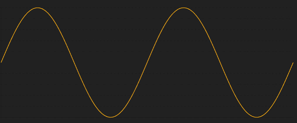
Why It Matters: It’s the lifeblood of economies, stock markets, and seasonal industries, showing us that what goes down often comes back up.
Consider the fashion industry. Trends cycle in and out, with bell-bottoms making a comeback just when you thought they were gone for good. The Rollercoaster keeps us guessing and always coming back for more.
7. The Wave Rider 🎢➖🎢 (Mounting S-Curves)
Meet the Wave Rider: This curve catches new waves of growth just as the old ones start to fade, creating a series of overlapping S-curves.
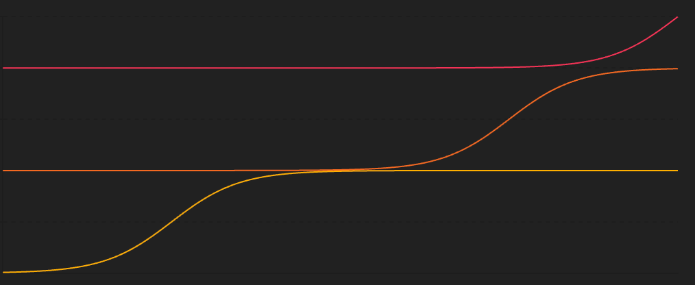
Why It Matters: In fast-paced industries like tech, innovation keeps the growth waves coming.
Take the smartphone market. Each new model rides the wave of growth just as the previous one starts to level off. The Wave Rider is all about catching the next big wave and staying ahead of the game.
Playing the Curves in a SaaS Orchestra
Imagine a SaaS company as a vibrant orchestra, with each department playing its own instrument. The music they create together is the symphony of growth. The conductor? That’s you, the keen observer, interpreting the shapes of their growth curves. Let's dive into this orchestra, where each section plays its own tune, and see how the shapes of growth in different departments paint a unique and interconnected picture.
Marketing: The Rocket 🚀
Marketing's Tune: Our marketing team is the Rocket, taking off with exponential growth. They launch a brilliant campaign, and suddenly, leads are pouring in like a fireworks show on the Fourth of July. Every click, share, and like propels the curve upwards, creating an exciting, almost dizzying ascent.
This explosive growth means that awareness is spreading fast, and potential customers are knocking on the door. But beware, a Rocket's flight can't sustain itself forever without direction.
Sales: The Plateau Climb 🐍
Sales' Tune: Now, over to sales, where things look more like the Plateau Climb. At first, the sales team is riding high on the wave of new leads, but soon, the pace slows. They hit that middle stretch where converting leads into paying customers becomes a slower, more strategic game.
The Plateau Climb in sales reflects the reality that not every lead turns into a customer. The initial rush gives way to a more measured approach, where each deal requires careful nurturing. This S-curve reminds us that sales are a marathon, not a sprint.
Product Development: The Steady Eddie 📈
Product's Tune: Meanwhile, product development plays the steady, rhythmic beat of Steady Eddie. The team is focused on constant, incremental improvements, steadily rolling out updates and new features.
Consistent, linear growth in product development ensures that the software evolves in a reliable manner. It might not be flashy, but it's essential for maintaining user satisfaction and staying ahead of the competition.
Customer Support: The Falling Star 📉
Support's Tune: Over in customer support, we sometimes see the Falling Star. When a new feature launches, support tickets skyrocket as users scramble to understand the changes. But as users get accustomed, the number of tickets drops off rapidly.
The Falling Star curve here isn't necessarily bad. It indicates that initial confusion is giving way to understanding, but it also highlights areas where user experience can be improved to prevent future spikes.
User Engagement: The Hype Cycle 🎢
Engagement's Tune: User engagement often dances to the beat of the Hype Cycle. A new feature or product launch grabs everyone's attention, creating a parabolic rise in usage. But as the novelty wears off, engagement might dip before stabilizing.
Recognizing the Hype Cycle helps the company prepare for the inevitable peak and trough, ensuring that subsequent updates can reignite user interest and smooth out the curve.
Revenue: The Rollercoaster 🔄
Revenue's Tune: Revenue can feel like a Rollercoaster, with cyclical patterns reflecting subscription renewals, seasonal spending, and market trends. One quarter might see a surge, followed by a quieter period.
Understanding these cycles helps in forecasting and planning. It's crucial for managing cash flow and setting realistic expectations for stakeholders.
Innovation: The Wave Rider 🎢➖🎢
Innovation's Tune: Finally, innovation surfs the waves of the Wave Rider. Each breakthrough creates a new wave of growth, just as the previous one starts to crest and fall.
Continuous innovation keeps the company ahead of the curve, ready to ride the next big wave. It shows that while individual products may peak, the company's overall trajectory remains upward.
Connecting the Shapes: The Symphony of Growth
Each department's growth curve tells a story, but it's the interplay between them that creates the full symphony. When marketing's Rocket takes off, it's crucial that sales’ Plateau Climb is prepared to handle the influx. Product's Steady Eddie ensures that what sales sell is solid, while support's Falling Star shows where improvements are needed. User engagement's Hype Cycle reveals the peaks and troughs of user interest, which revenue's Rollercoaster can anticipate. Innovation's Wave Rider keeps the whole company surfing towards the future.
When these shapes connect, they reveal underlying phenomena that single curves can't show.
For instance, a spike in support tickets (Falling Star) after a product update might correlate with a dip in user engagement (Hype Cycle), signaling a need for better user guides or a simpler interface. Or, if marketing's Rocket and sales' Plateau Climb aren't in sync, it might indicate a disconnect between what’s being promised and what can be delivered.
By understanding and connecting these growth shapes, you become a master conductor, orchestrating a harmonious and forward-moving symphony.
So next time you look at your company’s metrics, don’t just see numbers—see the music, feel the shapes, and understand the story they’re telling.
Conclusion
Shapes tell stories that numbers alone can't capture. Whether it's the explosive ascent of the Rocket, the steady climb of Steady Eddie, or the thrilling ups and downs of the Rollercoaster, these curves shape our understanding of progress and decline. By recognizing these patterns, we can better navigate the complexities of our world and perhaps even predict the next big wave.
Now, go forth and train your eye to spot these curves in the wild. Who knows? You might just be the first to see the next big trend coming!