


The Secret Sauce Behind Amazon's Weekly Business Review (WBR) - Part 1
A Journey Through Time and Data

In the bustling corridors of Amazon's headquarters, a weekly ritual unfolds that has become the stuff of legend in the business world. It's not a shamanistic dance around a bonfire of old inventory reports, nor is it a gladiatorial combat between department heads (though some might argue it feels that way). No, it's something far more powerful and, dare I say, elegant: the Weekly Business Review (WBR).
But before we dive into the Amazon of today, let's hop into our time machine and set the dial to post-World War II Japan. Buckle up, folks – we're about to embark on a journey that would make even Jeff Bezos's eyes twinkle with geeky delight!
The Prophet Unheard in His Own Land

Picture this: It's the 1950s. Elvis is gyrating his hips, the Cold War is heating up, and in Japan, a quiet revolution is taking place, all thanks to an American named W. Edwards Deming. Now, Deming wasn't your typical post-war hero. He didn't liberate any countries or invent rock 'n' roll. No, his superpower was... statistics. (I can hear the swooning from here!)
Deming had tried to sell his ideas about quality control and continuous improvement to American companies, but they were too busy counting their post-war dollars to listen. So, like any good prophet, he took his message abroad. Japan, still reeling from the war, was all ears.
Deming's message was simple yet profound: By focusing on quality and continuous improvement, companies could increase productivity, decrease costs, and dominate markets. Japanese industries embraced his philosophy wholeheartedly, and the rest, as they say, is history. (Or in this case, the reason why your first car was probably a Toyota.)
Deming's Triumphant Return
Fast forward to the 1980s. America's industrial dominance was waning, and Japanese companies were eating their lunch (with impeccably manufactured chopsticks, no doubt). Suddenly, those same American executives who had dismissed Deming decades earlier were scrambling to understand the secret of Japan's success.
Enter the NBC documentary "If Japan Can... Why Can't We?" which aired in 1980 and featured none other than our statistician hero, W. Edwards Deming. Overnight, Deming went from obscure consultant to management guru. At the ripe age of 80, when most people are content to yell at clouds and perfect their lawn-mowing techniques, Deming found himself in high demand.
His "14 Points for Management" became the new gospel for American industry. Companies like Ford embraced his methods, leading to dramatic improvements in quality and productivity. Deming's philosophy, which emphasized long-term thinking, continuous improvement, and respect for workers, was a stark contrast to the short-term, profit-focused mentality that had dominated American business.
Deming's return to prominence in America was a vindication of his life's work. It also served as a humbling reminder to American industry that sometimes, the most valuable insights come from unexpected places – like a statistician with a passion for quality control.
The Wheeler Dealer of Data

As Deming was enjoying his late-career renaissance, another figure was emerging in the world of statistical process control: Donald Wheeler.
If Deming was the philosophical grandfather of quality control, Wheeler was the cool uncle who could explain it all in a way that even the most math-phobic manager could understand.
Wheeler, a student and colleague of Deming, took the complex statistical concepts and distilled them into something so simple, yet so powerful, that it makes Excel pivot tables look like child's play. He called it Statistical Process Control (SPC), but don't let the fancy name fool you – it's basically a way to tell if your business is on fire, and not in the good way.
Wheeler's Contribution: Making the Complex Simple
Wheeler's genius lay in his ability to make statistical concepts accessible and actionable. His book "Understanding Variation: The Key to Managing Chaos" became a bible for managers looking to make sense of their data. Wheeler introduced the concept of "process behavior charts," which would later evolve into the XmR charts we know and love today.
But Wheeler's contribution went beyond just simplifying statistical concepts. He emphasized the importance of understanding the difference between "common cause" variation (the normal fluctuations in any process) and "special cause" variation (the outliers that signal something has fundamentally changed). This distinction is crucial for managers who want to avoid the twin pitfalls of overreacting to normal variations and underreacting to significant changes.
Wheeler's big idea was this:
Every process, be it manufacturing widgets or managing a team of coders fueled by energy drinks and dreams, has natural variation. The trick is to know when that variation is just business as usual, and when it's a sign that something's gone horribly wrong. Enter the XmR chart, the Swiss Army knife of business metrics.
XmR: The Chart That Launched a Thousand Ships (and One Very Big Online Bookstore)
Now, let's dive deeper into the XmR chart, the unsung hero of process control that's so simple, even your cat could learn to read it (though they'd probably prefer a chart tracking treat distribution).
XmR stands for "Individuals (X) and Moving Range (mR)." It's a type of control chart that's particularly useful for tracking processes where you only have one data point at a time – like daily sales figures, weekly website traffic, or the number of times your CEO says "synergy" in a single meeting.
The Anatomy of an XmR Chart
An XmR chart is actually two charts in one:
The Individuals (X) Chart: This shows your actual data points over time. It helps you see trends and patterns in your process.
The Moving Range (mR) Chart: This shows the absolute difference between consecutive data points. It helps you understand the variability in your process.
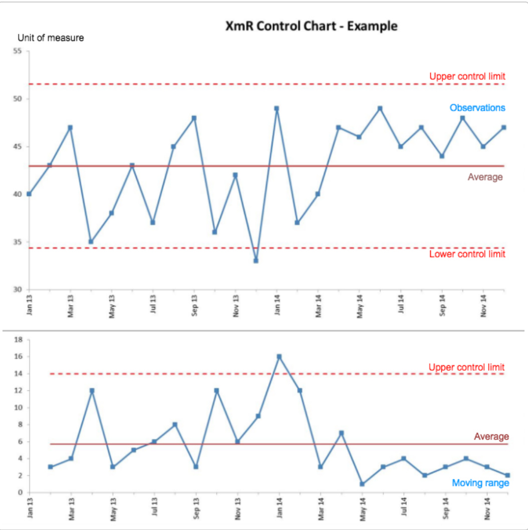
Each chart has three key elements:
The data points themselves
The central line (usually the mean or average)
Upper and Lower Control Limits (UCL and LCL)
The control limits are the secret sauce here. They're calculated based on the natural variation in your process, and they tell you when something unusual is happening. If a point falls outside these limits, it's time to put on your detective hat and figure out why.
How to Read an XmR Chart: A Step-by-Step Guide
Let's break down what we're seeing in our churn rate XmR chart:
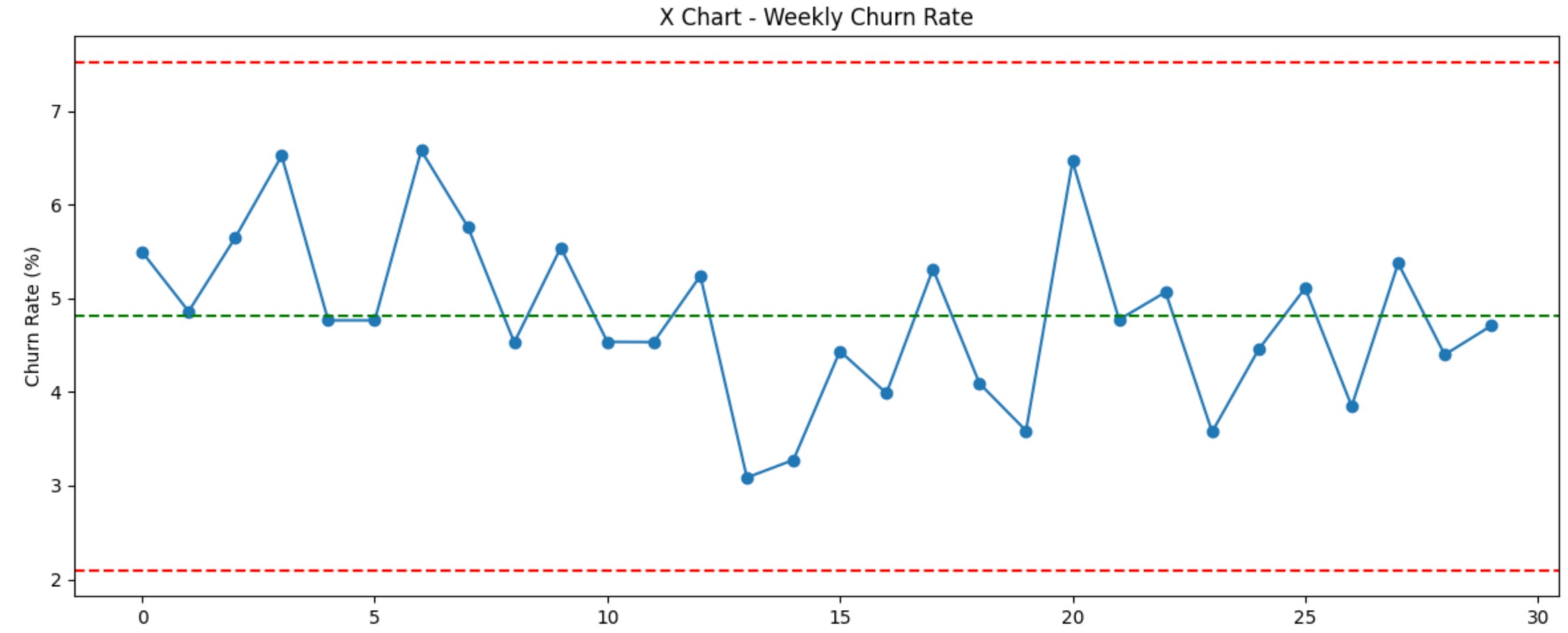
The X Chart (top):
Each point represents our weekly churn rate.
The green line is our average churn rate.
The red lines are our Upper and Lower Control Limits.
The MR Chart (bottom):
Each point represents the change in churn rate from one week to the next.
The green line is the average change.
The upper red line is our Upper Control Limit for change.
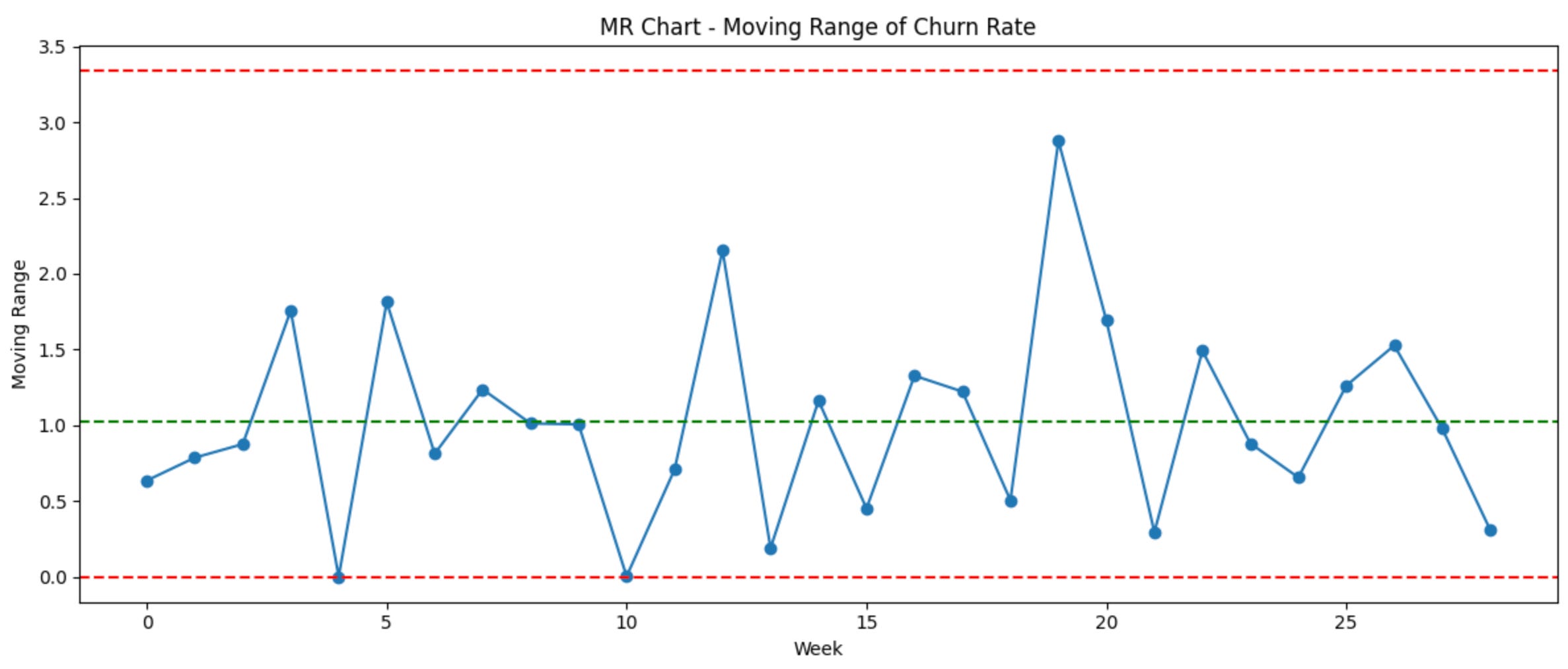
If we see a point outside the control limits on either chart, it's time to investigate. Maybe we rolled out a buggy update that week, or perhaps a competitor launched a too-good-to-be-true promotion.
Remember, the goal isn't to eliminate all variation – that's impossible unless you're dealing with robots (and even then, they might unionize). The goal is to understand your process, identify when something unusual is happening, and take action when necessary.
Quick Tips
Look at the overall pattern: Is it stable, trending up or down, or wildly fluctuating?
Check for points outside the control limits: These are your red flags. Something unusual is happening.
Look for runs: Seven or more points all above or below the mean, or seven or more points all increasing or decreasing, can indicate a shift in your process.
Check for alternating patterns: If your points are alternating up and down in a regular pattern, your process might be over-controlled.
Compare the X and mR charts: If you see a signal on one but not the other, you might be dealing with a gradual shift in your process.
Now, I promised you some code, and unlike a politician's campaign promises, I intend to deliver. Let's imagine we're running a SaaS company that caters to everyone from solo entrepreneurs to Fortune 500 giants. We want to keep an eye on our customer churn rate because, let's face it, losing customers is about as fun as a root canal performed by an over-caffeinated chipmunk.
Here's how we might set up our XmR chart using Python:
https://colab.research.google.com/drive/1jOl_uA-M9a4Djqfi0ZeftN8Tj4uRWuTQ?usp=sharing
This code will generate an XmR chart that would make Donald Wheeler proud (and possibly a bit jealous that we can do in seconds what used to take hours with graph paper and a slide rule).
Conclusion (No wait there is more ….)
Now, I know what you're thinking: "This is all fascinating, but what does it have to do with Amazon? Did Jeff Bezos secretly moonlight as a statistician? Is that why he's bald – from pulling out his hair over standard deviations?"
Well, my curious friend, the answers to these burning questions (except maybe the baldness one – that's between Jeff and his follicles) await you in Part 2 of our statistical adventure. We'll explore how Amazon took these seemingly dry concepts and turned them into a secret weapon so powerful, it makes Thor's hammer look like a plastic squeak toy.
So, if you're ready to discover how a bunch of number-crunching techniques helped create one of the world's most valuable companies – and perhaps pick up some tips for your own world domination plans along the way – then click on through to Part 2. Trust me, it'll be more exciting than Prime Day for stats nerds!
And remember, in the world of data, always be plotting... your next move, that is. See you in Part 2 .
Deep Dive
"If you're itching to dive deeper into the world of XmR charts (and let's face it, who isn't dreaming of swimming in a sea of statistical process control?), you might want to check out
Donald Wheeler's 'Understanding Variation'
Edward Deming’s ‘Out of Crisis'
Luca Willington’s ‘Introduction to XmR Charts’